If you had been a fly on the wall, this is the conversation you might have overheard:
Museum Director: We really need to do something to attract more visitors to the Harry S. Truman Library and Museum.
Marketing Director: Well, perhaps we should print a postcard.
Museum Director: Great idea, but which exhibit should we feature? There are so many good ones to choose from.
Marketing Director: Well, we could feature a photo of the atomic bomb along with a catchy slogan.
Museum Director: Or something about the Cold War or Israel...
Marketing Director: Maybe we should go with something less controversial.
As you can see, the results were very good. The eye is drawn to numerous points of interest: flags, lectern, electrical outlet, presidential seal, heating vent, wide expanse of wall, metal windows with photos attached to the glass. You can't go wrong.
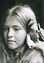
And then there's this memorable postcard. I don't know. Am I missing something? Who would send this? And who would they send it to?
Here are the backs of the postcards.
skip to main |
skip to sidebar

About Me

- Christine H.
- I love antique postcards because they preserve evidence of everyday life as well as celebrations and sad events. Looking at an old postcard is like holding a single piece of a puzzle; we have to imagine the rest. I will try to put up a postcard every day. If you have a special request for a particular city or place, let me know!


hahahaha so funny. yes, the North Wall. That is less controversial ^_~
ReplyDeleteHa ha ha, der Dialog ist grossartig.
ReplyDeleteDiese Postkarte verdient in Ruhmeshalle der langweiligsten Fotos der Welt zu kommen
Ha! That museum postcard is absolutely priceless!
ReplyDeleteIf I saw the first postcard for sale anywhere I'd snap it up in an instant! What were they thinking indeed...
ReplyDeleteWell....if I got that first postcard I would most definitely tart it up with washi tape and collaged items....you know how I am...
ReplyDeleteTrue art, both of them.
ReplyDeleteThe fellow in the second one needs a voice bubble, "Did those flowers smell like chloroform?"
The Stephen Foster one is a little creepy... Maybe they were thinking of the Rousseau painting The Dream.
ReplyDeleteGood idea, Pamela. I think the first one needs some naked people...or at least women in bikinis. I know that's not what you meant when you said 'tart it up', but that's where I went with it.
ReplyDeleteApparently at the Truman Library the buck stopped outside the doors since there was no money for museum design.
ReplyDeleteThe Beautiful Dreamer card is totally creepy, and not just because she is 3 feet taller than him...
ReplyDeleteI love post cards! Looking forward to all you have to share since I have become a follower.
ReplyDeletecindy
Welcome Cindy!
ReplyDeleteThe creepy Beautiful Dreamer one reminds me of a postmortem card. :-o
ReplyDeleteThat "north wall" card is,....interesting. Do you suppose it's from a series that included the south, west, and east walls?
ReplyDeleteThe North wall is hilarious. I would buy that for my "boring" collection.
ReplyDeleteWhen I saw Beautiful Dreamer, the first thing that popped into my head was something about having gas....:)
ReplyDelete